Data visualization is one of the most important tools when it comes to understanding businesses quantitatively. It's often nearly impossible to look at raw and even organized data and make any conclusions about the current state or trends within a business. I have found time and time again that nothing beats a good chart to illustrate how a business is operating - it can effectively bridge the gap between the qualitative understanding and the objective data. (See here for some of my early work with charts... story for another time.)
There's no doubt that many people have made a profession of doctoring data for the wrong reasons, but matching a story and an underlying truth to the proper visual can be a game changer for company leadership that allows them to make quick, informed decisions for a business. It also helps investors do quick diagnostics to understand the health of a business - founders owe it to themselves to guide investors to look at operating data in the right way.
One of the mistakes I see time and time again is using the wrong time step. I once met with a company that kept telling me about their MRR...except the company was selling $50k-150k three to five year contracts. Yes, one can calculate MRR for this company, but it simply does not tell the story of how the company is actually doing or where they are headed. As I explained to the founder, they should lead with bookings TCV - this is their highest number and represents the value of their signed contracts in hand, which is huge! They can then speak to the ARR, which is a more representative number for contract lengths and sizes they are working with. Ultimately they will need to justify their top line numbers to a CAC in their unit economics calculation. Maybe it's just me, but when I hear MRR, I think monthly contracts and when your CAC payback is 15-18 months, that's a scary proposition. Whereas, when you've signed a customer to a 3 year deal and gotten paid upfront, that CAC payback perfectly acceptable.
One of the core data sets I always ask a company to produce is their monthly revenue by customer. This is also an output that I design into salesforce implementations. I want to see the recognized revenue every month for every customer. From this data, along with sales and marketing spend + sales cycle length data, I can calculate nearly every SaaS metric there is and understand an immense amount about the health of the business (without even knowing what the business does). It's a bonus to know the length of every customer contract as well, but you can usually figure it out by looking at when customers churn.
Below are four charts of the same exact company data visualized in four different ways. Each of them tells a different story and provides a different level of insight into the business. (Note that whether these showed ARR or MRR it would be the exact the same visuals at 1/12 scale. Also note that this isn’t a full company analysis).

This chart shows steady growth up and to the right. Not explosive, but solid. We can see that some months add very little ARR and some it's more, and it seems to alternate between upsell and new customer sales. It's very difficult to understand what's going on in this business and how well it's working from this chart alone.

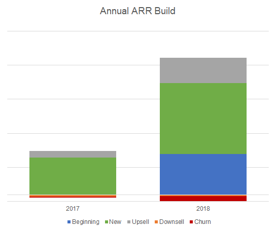
Now if we zoom out to the annual ARR build we can see that with only two years of data, there's not too much to glean. We can see they roughly tripled in a year with a healthy amount of new and upsell + minimal churn. But it's hard to know if this business is accelerating, and from the monthly view we know that it's not.

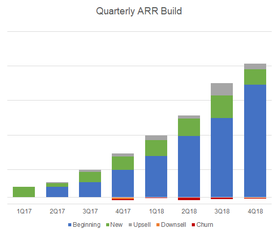
Finding the happy medium for this particular company, we look at the quarterly ARR build. This chart shows a more consistent, discernible pattern in the operating data and trends start to emerge in new, upsell and churn. But does it tell the whole story?

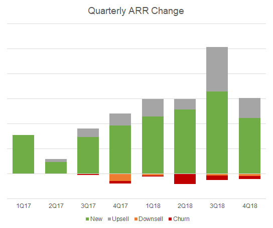
If we take this one step further and do a simple "thin slice" on this data, we can instantly take our understanding of the business operations to a new level. By deleting the blue bars, we are now only looking at the changes to ARR every quarter rather than the total ARR. This is like double clicking on the operations of the business with a single chart. We can now answer questions about sales efficiency and customer retention in much greater detail by simply looking at the chart. Yes, the power of SaaS is that you build on top of everything you did before, but operationally, we want to see that with greater CAC spend, a company can grow faster. After all, that is what venture capital is usually used for - accelerating businesses that are exhibiting positive unit economics. Here we see that although the business is growing consistently, their ability to accelerate by spending more on CAC is just not there. The new ARR added between 4Q17 and 4Q18 is negligible. They benefited from a large upsell in 3Q18, but it looks like it was a one-time event. (Note that if this company showed no increase in total CAC spend over 2018, I would view this as a great investment opportunity.)
Based on this read, we can now draw some conclusions about the company: it is growing steadily and has exhibited consistent new ARR and upsell while maintaining low churn and downsell. On the other hand, a quick look at the S&M data shows that they have been unable to accelerate their growth by spending more, and therefore efficiency is going down. While it looks like a pretty strong business, investing in this business without a deeper evaluation of the sales and marketing strategy would probably not be prudent. By slicing the operating data the right way, I can systematically peel back layers on the business to see what's really going on under the hood and figure out what is working and where there is opportunity.
Oh and one more thing - make sure your charts are the right shape (and colors) to get your message across! Don’t butcher your own data.

Hope this is helpful and interesting. I am always open to questions, comments and feedback.


